
Creating Your Research Poster: Design Elements
By Mindy M.
Design Elements to Consider When Creating a Research Poster
When designing a research poster, your primary concern may be the content. Am I communicating my results effectively? Do my results prove my hypothesis? Is my research clearly presented to someone unfamiliar with my topic? These are all questions you may ask yourself about your poster.
But a huge part of creating a research poster is the intentional design of your poster. The design dictates how easily a viewer can move through and read your work. Some questions you may ask yourself as a designer could be: Is my text large enough to be legible? Do I have a good mix of graphics compared to text? Do the parts of my poster (introduction, methodology, results, etc.) flow logically?
This resource will consider all of these questions and more, as well as which design programs may be the best fit for you.
Components of Designing a Research Poster
As mentioned above, the design of your poster is vital to conveying your research and message. Below are some factors to consider when creating your poster.
Layout
When you begin designing your research poster, consider the layout most appropriate for your discipline. For example, humanities disciplines may use argument or chronological poster models, whereas science disciplines may use visualization or newspaper models.
Design Principles
You can use design principles to help arrange your poster. To help with this, remember C.A.R.P.: Contrast, Repetition, Alignment, and Proximity.
Contrast: Visual differences that improve clarity and create emphasis.
Alignment: Placement of components along vertical and horizontal lines.
Repetition: Consistent use of the same visual elements throughout a design.
Proximity: The use of distance between elements.
For more information on C.A.R.P., visit the Writing Center's resource on design principles.
Colors
Choosing a consistent color scheme or following the color scheme your symposium provides keeps your poster cohesive and visually compelling. If you are looking for color combinations, websites like Coolors can help you develop a palette.
Additionally, if conferences or symposiums ask you to follow your university's colors, you can find FSU's brand guidelines here.
Negative Space
Negative space refers to the spacing between elements. Because there may be many elements on your poster, negative space is essential for allowing breathing room throughout your design.
Graphics
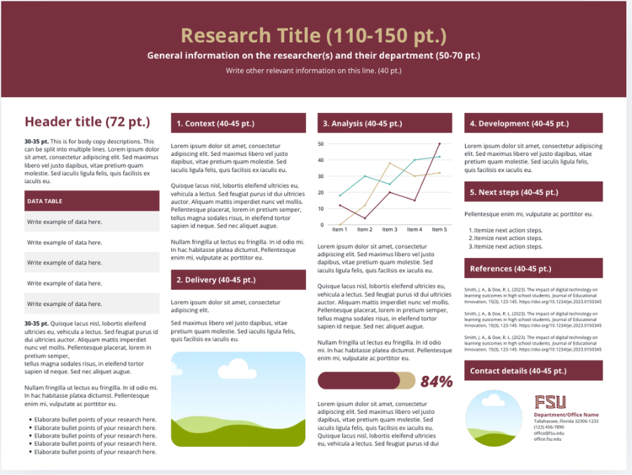
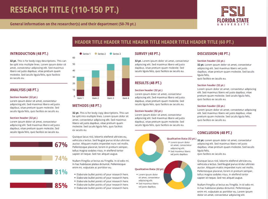
Graphics are essential for conveying quantitative information and providing visual variety. Any graphic you include—an image, table, graph, etc.—should be visible when viewing your poster from 3–5 feet away.
Poster Design Programs
Canva
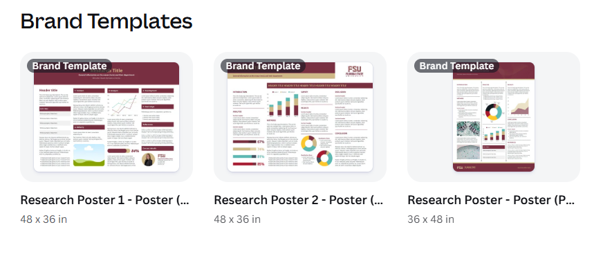
Pros and cons: Canva is easy to navigate and use design elements, as well as being available on all computers. It has a click-and-drag interface, meaning incorporating elements is simple. There are many different templates available on Canva for research posters to help you get started. You also have the option to download a design from Canva and open it in Google Slides and PowerPoint.
The biggest drawback to Canva is that it has no spell check, so you’ll want to keep the text on your poster in a separate document like Google Docs or Word and copy-and-paste the information over.
Additionally, by logging into Canva with your FSU account, you can get access to FSU brand templates, including posters (and you get access to Canva Pro)!
Google Slides
Pros and cons: Google Slides really benefits from having an easy learning curve to use and navigate. Because it is web-based, it’s available on all computers, phones, and tablets. You are able to design your own charts, tables, and other graphics within the site, and easily import other files like tables and documents from within the Google Suite (Google Docs, Google Sheets, etc.).
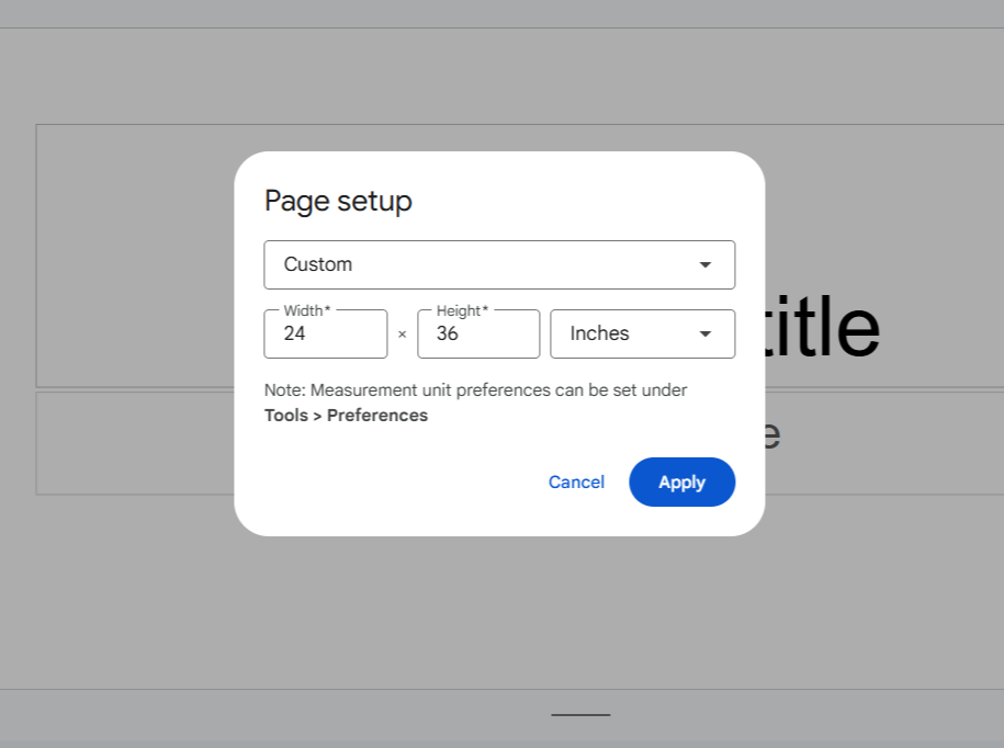
Some drawbacks of Google slides lie in the difficulty in formatting certain elements. Resizing your document for printing is tricky if you don’t set it up in the beginning. To set up the page dimensions for your poster in Google Slides, go to File -> Page Setup and add custom dimensions (common poster sizes are 11x17, 18x24, 24x36, and 36x48). Here is an example of what the Page Setup context menu looks like:
Google Slides is a great option for students already invested in the Google Suites ecosystem or students who want a more beginner friendly option for arranging and designing their posters. You can log in to Google Slides here to give it a try!
PowerPoint
Pros and cons: PowerPoint has many of the same benefits and drawbacks of Google Slides. While it can be web-based too, it also has a dedicated app for desktops and mobile devices. It offers easy navigation, and allows you to design your own graphics. PowerPoints tools are a little more robust which can be helpful, however these more granular tools can be harder to work with. Like how Google Slides integrates with the Google Suite, PowerPoint works well with other Microsoft Office applications such as Excel and Word.
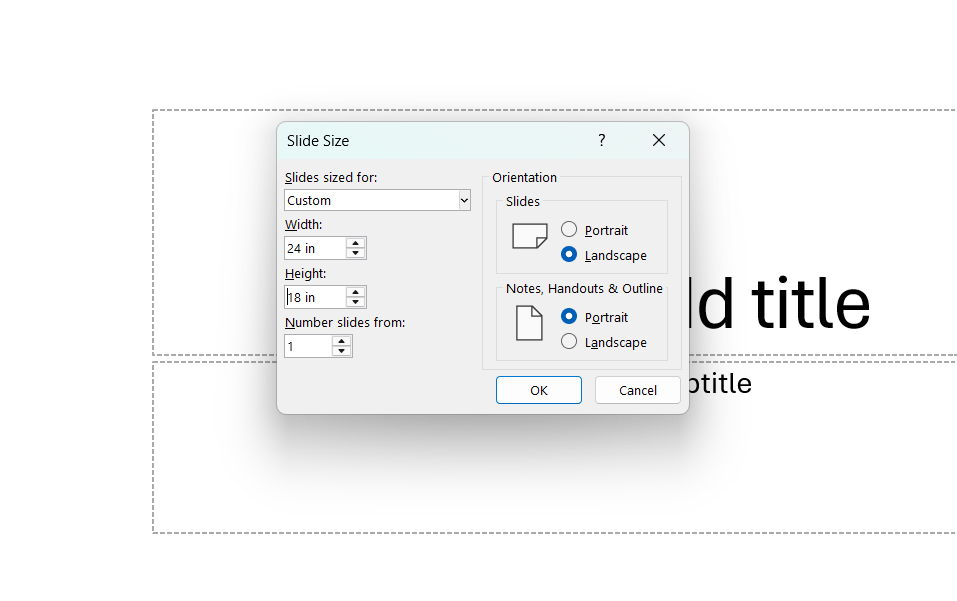
Similarly to Google Slides, you should change your document dimensions before starting. To set up page dimensions for your poster in PowerPoint, go to File -> Page Setup or Design -> Slide Size and add custom dimensions. Here is an example of what the Slide Size context menu looks like:
As an FSU Student, you are able to download and use the Microsoft Office Suite for free! For information on how to download and access PowerPoint and other Office Applications, check out the FSU's ITS resource on Office 365.
By this point, hopefully you can be more confident and well-equipped to design your research poster!
Additionally, if you are looking for guidance on what content you should include in your poster, please check out the Writing Center’s resource on Creating Your Research Poster: Content and Formatting!