
CARP Principles of Visual Design
Putting together a visual design can be daunting. You may have a final vision but not know how to get there, or you may have all the components but not know how to pull them together into a cohesive vision. When you are feeling this way, it can be helpful to have a set of guidelines to give yourself some direction for how the pieces of a design can fit together. One of the most common acronyms to help with this is CARP: Contrast, Alignment, Repetition, and Proximity.
This resource will provide you with a quick guide to understand CARP principles and how they might help you as you create and revise your visual design. It uses slides overviewing the principles as examples of CARP principles, comparing slides which fail to consider CARP principles to slides which succeed at applying CARP principles.
 Writing Consultant
Hi! I'm Joseph, your friendly neighborhood writing consultant.
I’ve been working on some slides to teach you all about the principles of CARP, but I’m feeling like some things just aren’t quite working with them. Would you be willing to help? Great! I can’t hear you, but I’m hoping you said “yes.” Let’s look at my slides together and see if the CARP principles can help us identify what’s wrong!
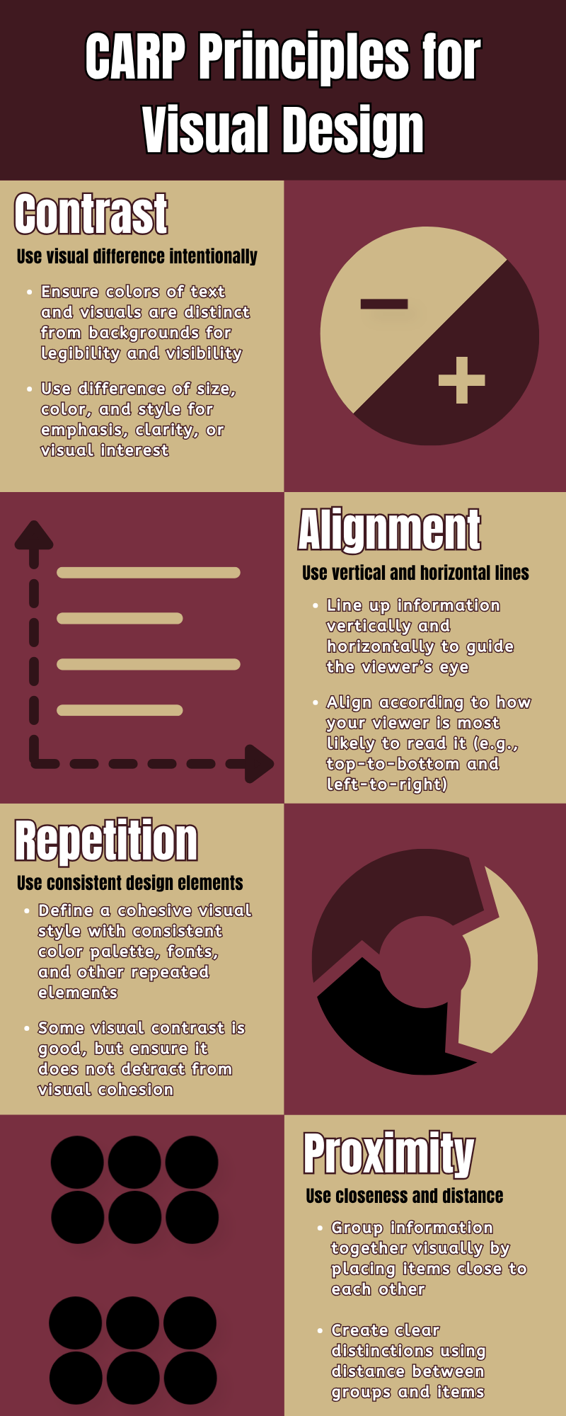
Click to enlarge guide
contrast
Visual differences which improve clarity and apply emphasis
The first principle that might make a difference is Contrast! Let’s take a look at the slide I’ve been working on to teach you all about it:
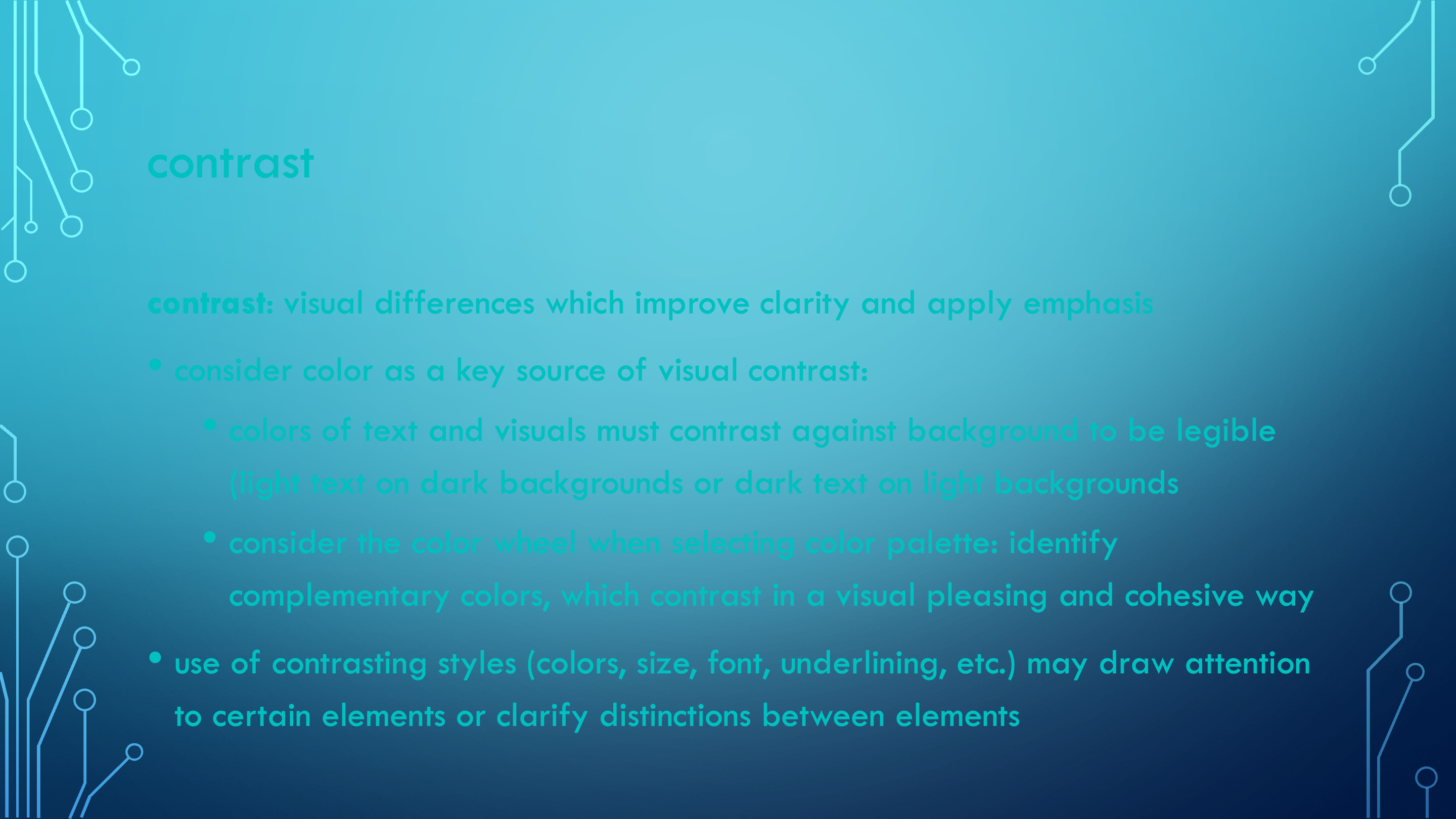
Hm. Maybe contrast is what this slide is missing. I really wanted to have a cohesive visual theme, so I chose a text color to match the background, but it’s not really working, is it? Parts of it are pretty hard to read. I’m also realizing that there isn’t any visual variation in the text styles anywhere; no different sizes, no special font styles, and not even any capitalization! Even in the parts you can discern, it all just looks a bit flat. Let’s try applying a bit of contrast and see how it helps:
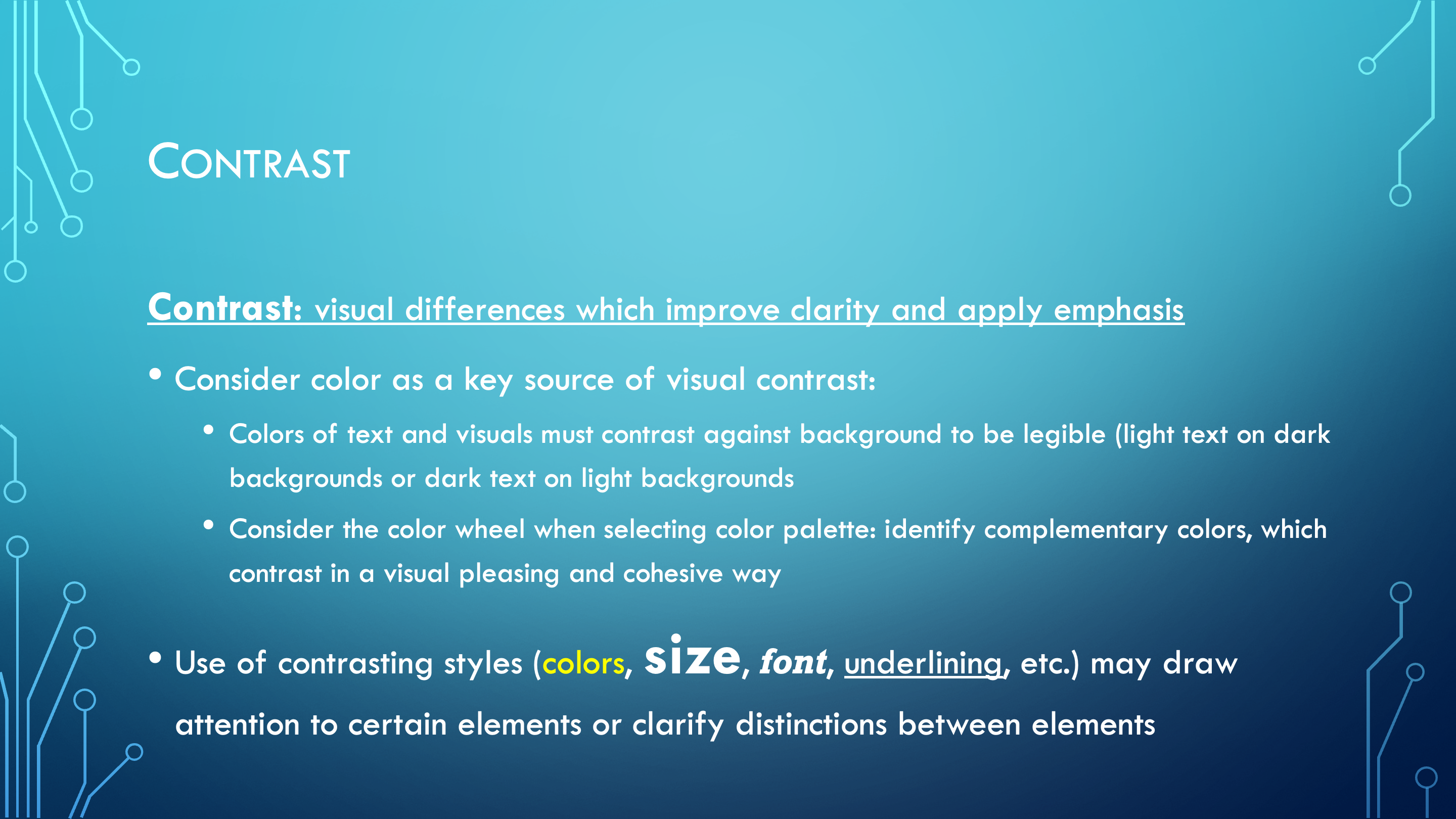
It sure is nice when things are visible, isn’t it? Sometimes it’s so hard to appreciate the little things until after you’ve lost them! Obviously, the big gamechanger here is that the text is a light color which contrasts against the darker background, making it much more legible. Beyond that, look at the use of different font styles and sizes: The title is in a different, larger font which stands out above everything else, and the bolding and underlining of the key term and its definition draw your eye to that as the most important point on the slide. The different sizes of bullet points indicate the relationships between them: the use of smaller text for certain bullets clarifies that they are intended as subpoints for the larger points. These changes are making such a big difference already! Let’s see what other things we have to learn.
alignment
Placement along vertical and horizontal lines
Next in line: Alignment! Since that’s the topic, I really wanted to get creative with aligning text in a bunch of different ways. Let’s take a look at what I have:
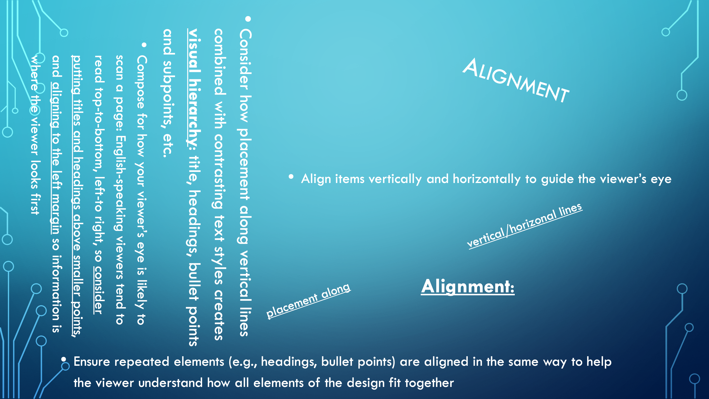
Ok, wow. I admit, maybe I went a little off the rails. Where are we even supposed to start reading? Why is there text going in every direction? Am I supposed to turn my head sideways to read that big block of text? And what about the diagonal text? It’s attention catching for sure, but I can’t make out how it fits with anything else on the slide.
I can see the one point about alignment being the way to guide the viewer’s eye. If that’s the case, alignment must be the problem here, because my viewing eye is feeling very unguided right now. Let’s see how applying some principles of alignment can help us get our ducks into rows:
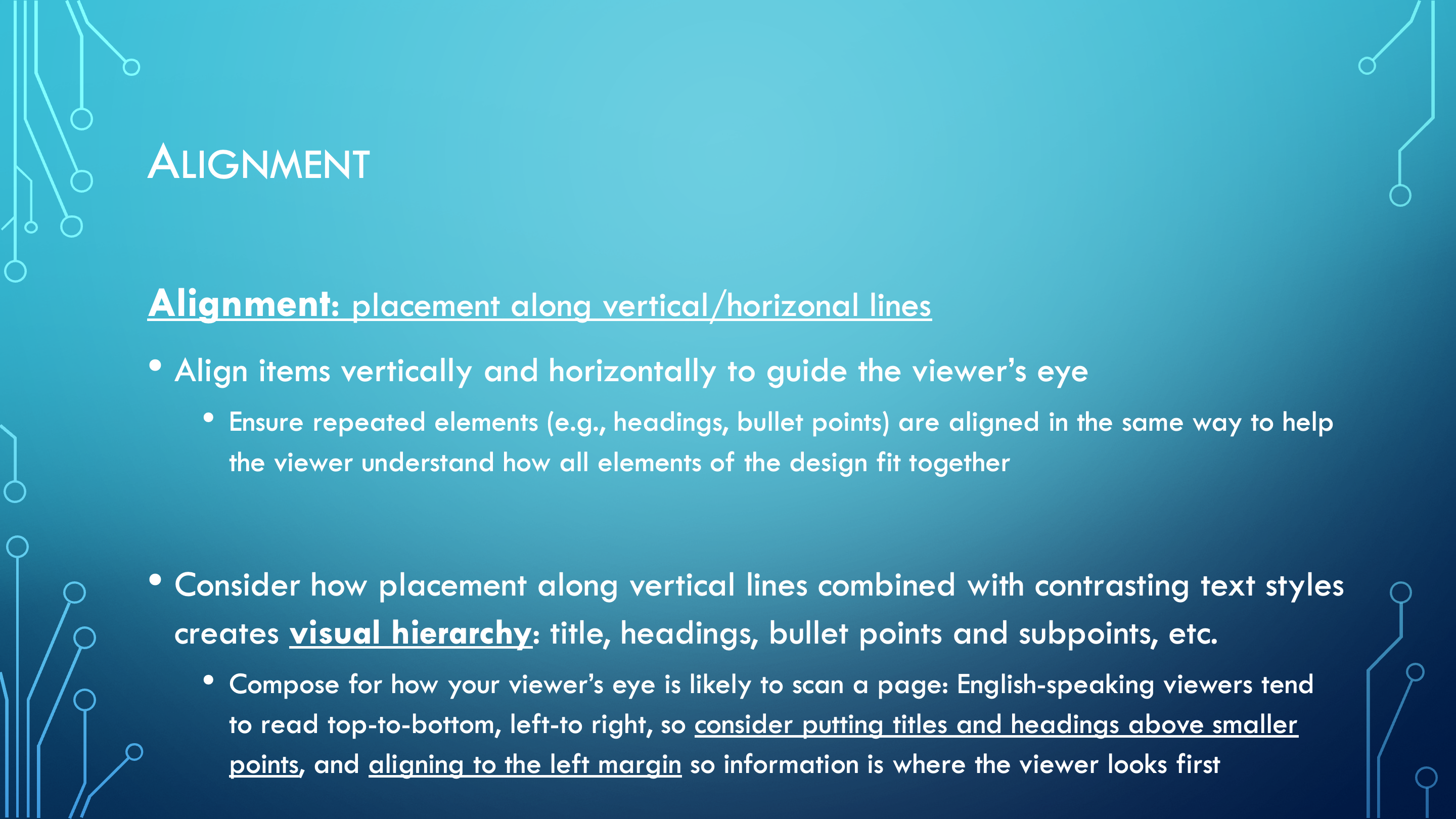
Now, that feels better. Notice how the title, heading, and larger/smaller bullet points are all aligned above and below each other in a way that makes the relationship between different parts clear. The two sets of larger and smaller bullet points are aligned along the same vertical lines, making it clear how the points and subpoints relate to each other. The viewer’s eye can start at the top left of the slide and then move top-to-bottom, left-to-right through the whole slide.
repetition
Consistent use of the same visual elements throughout a design
As we move on to yet another principle, Repetition, I’m finding myself still thinking about how I might do better with the principle of Contrast. These slides have enough contrast to be easy to understand, sure, but they are hardly doing anything eye-catching. So, I really wanted to find some creative ways to pack this slide full of contrast. Let’s see what I put together:
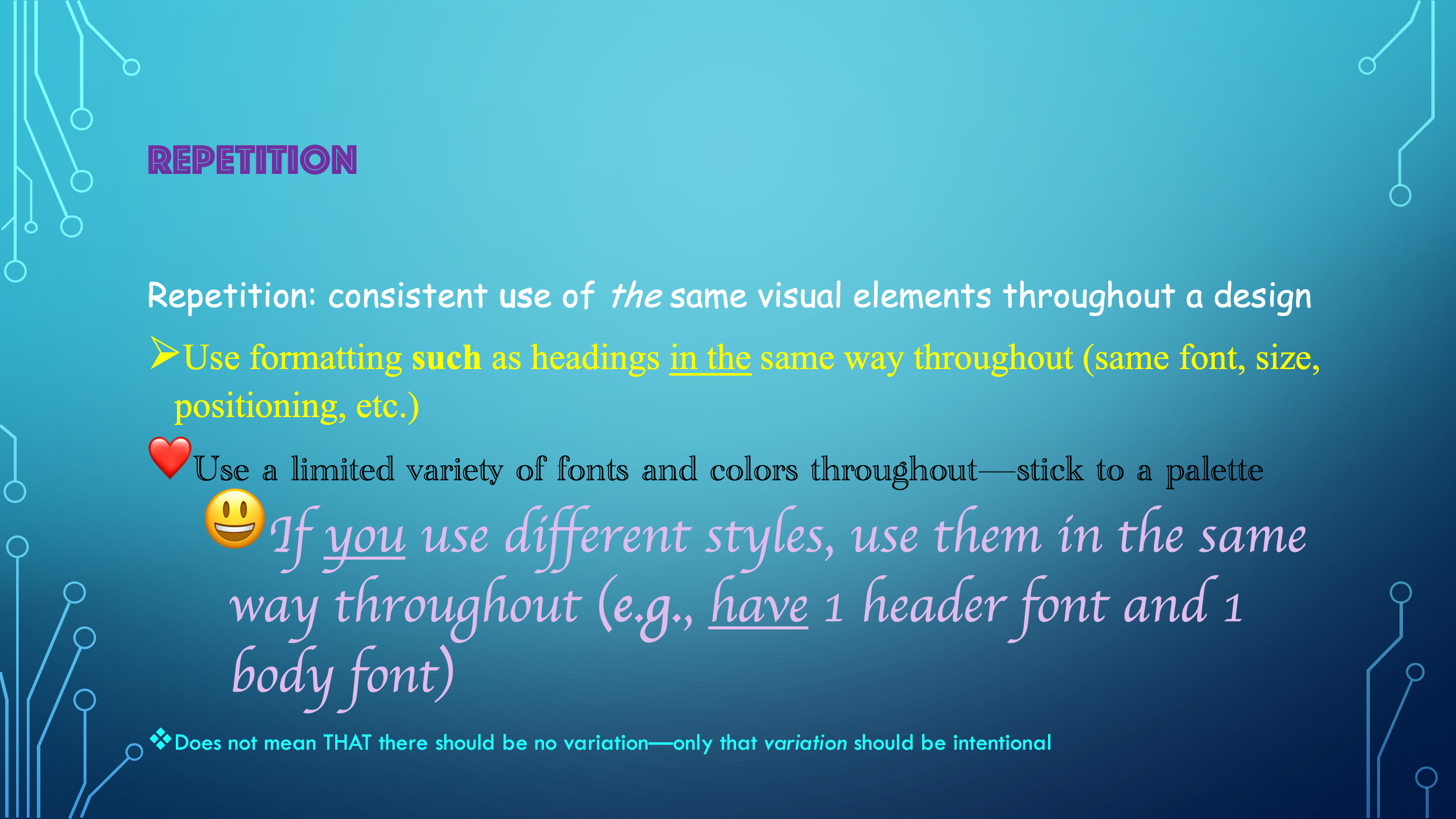
Isn’t that more fun? Look at all the colors and fonts! Any day I get to use Comic Sans is a good day in my book. And I was so excited to learn that you can use emojis for your bullet points! Ok, ok, reality check. Yes, it is fun, but if we want to have any semblance of professionalism, maybe it’s just a bit too much. We can’t be trying out a new font style every line, especially when none of the styles make any sense together. Let’s try using some repetition of styles to help it feel a bit more cohesive:
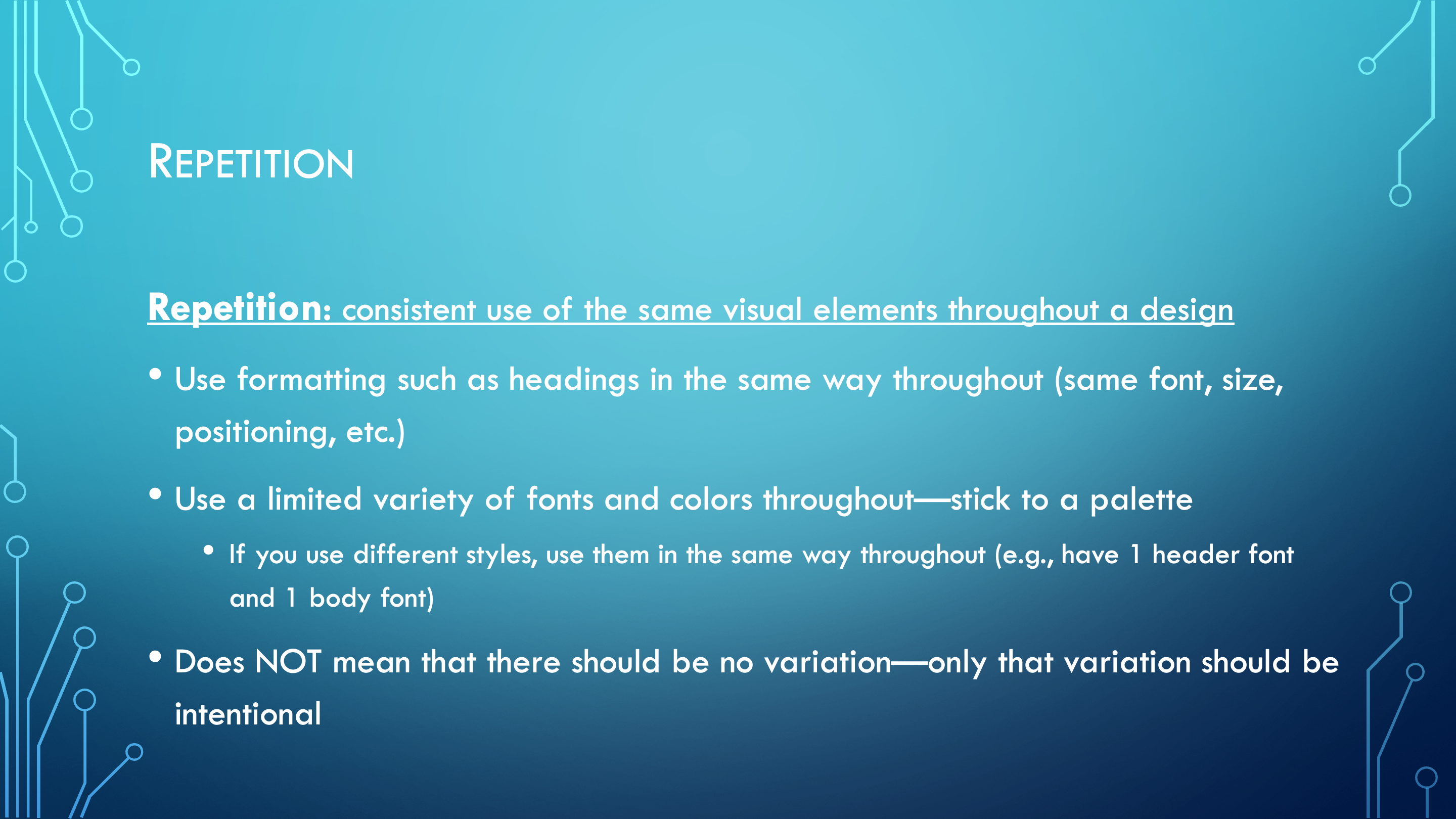
Admittedly, after seeing it with all the colors, maybe this looks a little plain by comparison. That said, a slide like this is much more likely to be taken seriously by its viewers, especially if you want to come across as a credible professional. This is why repetition matters: Without repeated stylistic elements, viewers will likely feel that your visual design looks disjointed or random. They might even get the sense that you had no plan or standard guiding you as you put it together, detracting from your credibility.
These slides use repeated elements such as title, heading, and bullets in consistent ways so that the viewer develops an understanding of how to move through the slides. There is one title font and one body font, and it is all the same color, giving it a cohesive look.
I find it helpful to think about the principles of Contrast and Repetition as counterpoints to each other. Contrast shows how visual difference can be used in service of a design, and repetition shows how the use of contrast needs to fit intentionally within a set of consistent, repeated visual elements. Applied together, these two opposite points help you put together a design which is clear, appropriate, and visually interesting.
proximity
Use of distance between elements
Following close behind is our final principle: Proximity! Here’s my slide about that:
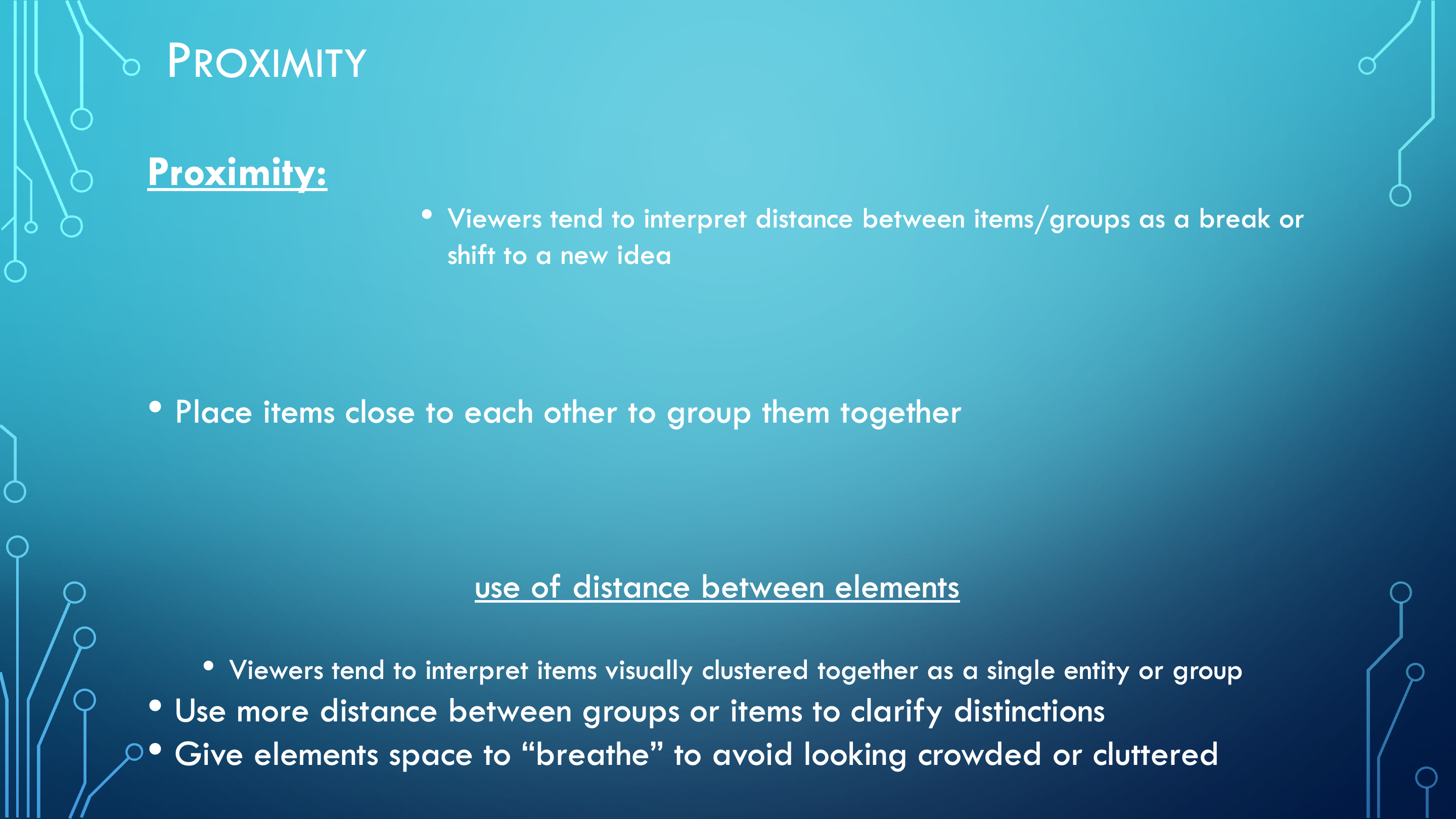
Ok, at least with this one, maybe the issues don’t jump off the screen quite as badly! When you try and read through it, though, you start having issues pretty quickly. We have some terms, bullet points, and definitions floating all on their own, with no clear connection to anything else in the design. Where’s the definition for Proximity—oh, there it is halfway down the page! What is it doing there?! Meanwhile, we have big sections of empty space and the last couple of points all crammed at the bottom—and none of those points even have anything to do with each other. Reading through this becomes a guessing game just to figure out which ideas are supposed to fit together. This goes to show the role of proximity for helping the viewer make sense of a design. Let’s see how proximity can help get this closer to what we want:
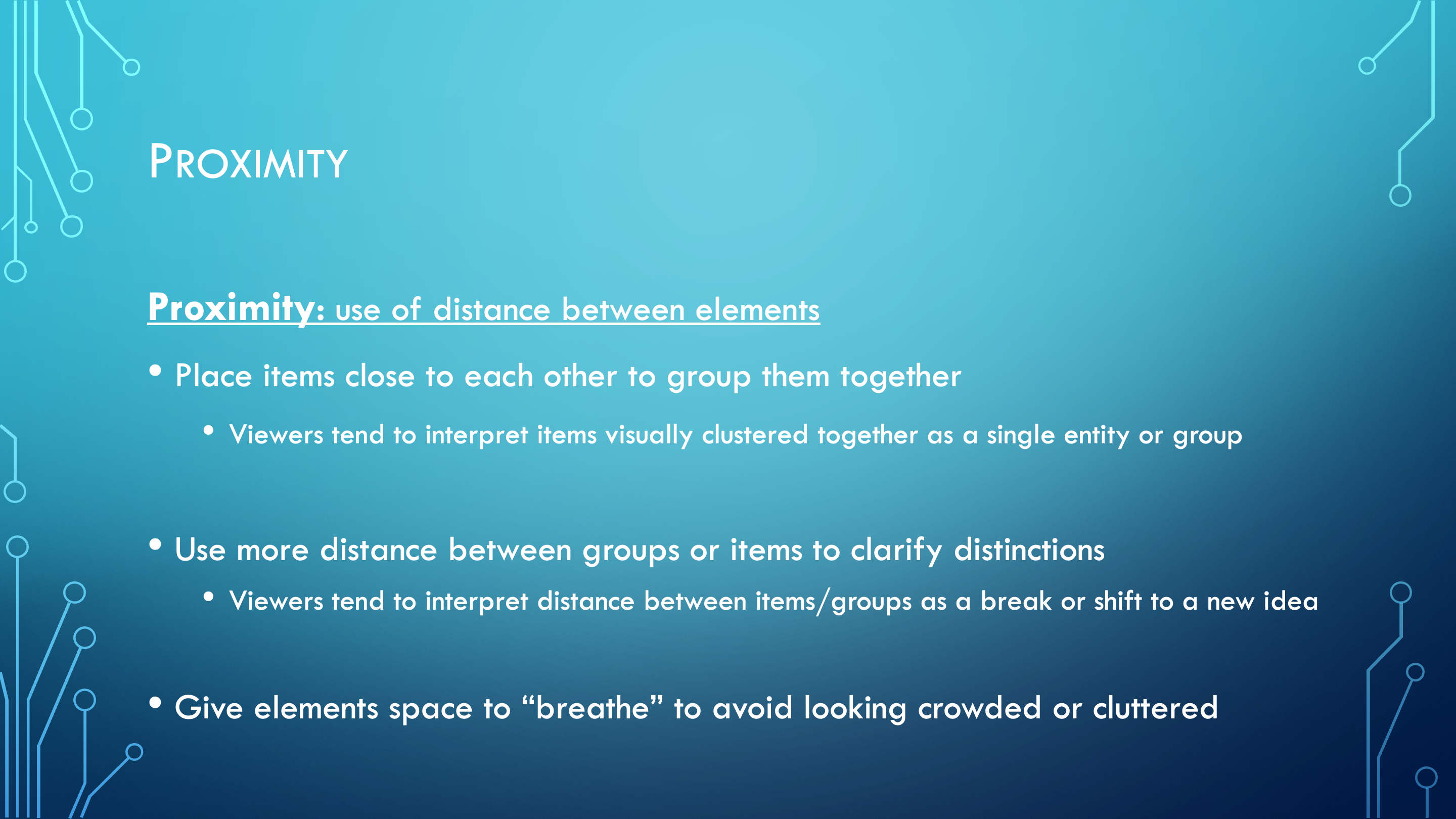
Now, isn’t that clearer? Just shifting things around makes the logical structure of everything way more obvious, even when all the text itself remains the same. Larger points are right above their subpoints, and the spaces between groups of bullets make it obvious when we are moving on to a new idea. Each idea has space to breathe, so you don’t need to comb through overwhelming blocks of text.